About the Press Symbol
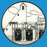
This logo has been in use for almost eighty years. My father, Kurt Melhorn, had it designed when he first went into business for himself as an electrical contractor. He did industrial, rather than residential work, installing power lines and building sub-stations, and wiring mines and mills. The triangular-shaped building is a mine head-frame and there are three electrical transformers in front of it. I chose this press symbol when I first started making books on my own, away from school. (I had used Orchid Press as my press name when I was first at Wayne State University.) I appropriated the logo from my father because I liked the idea of transformation. In my work, I have transformed old clothes into hand-made paper, women's stories into works of art and unlikely objects into books.
